Re-structuring Beroe
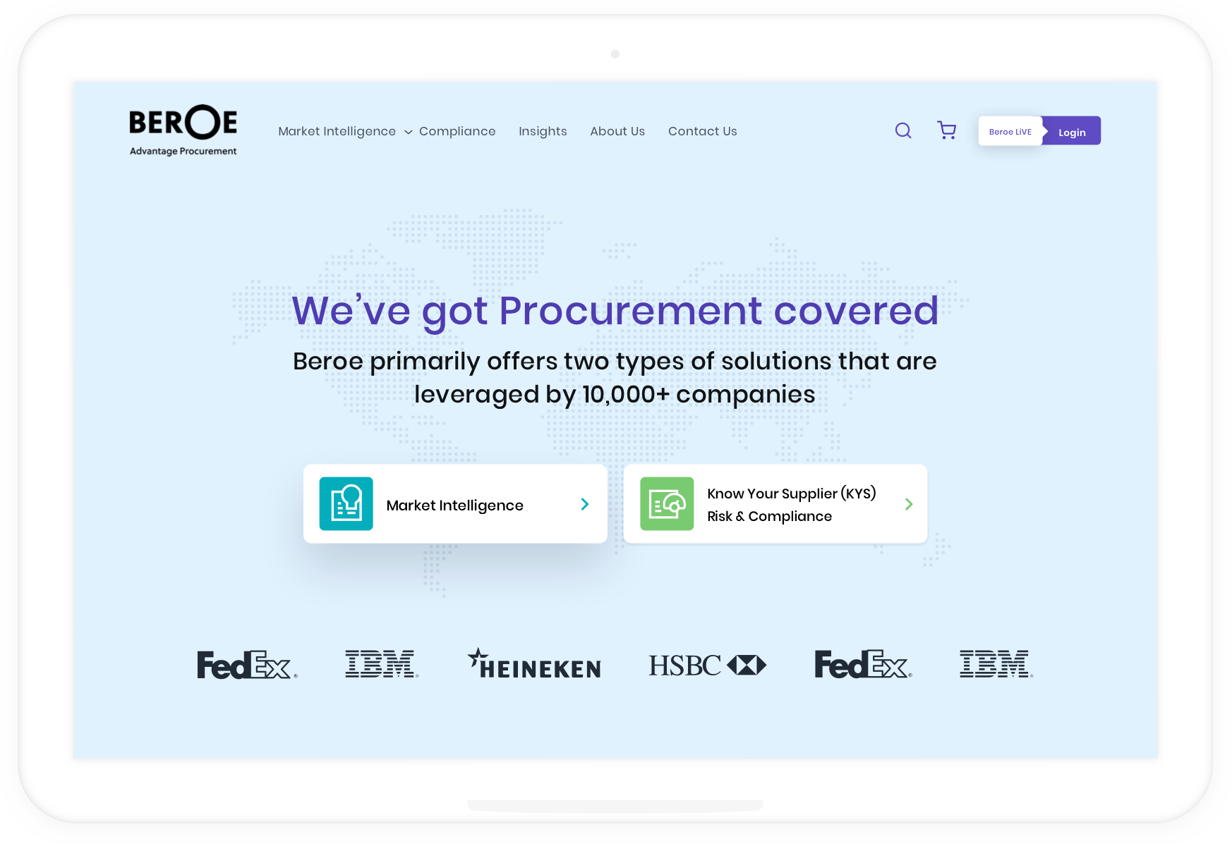
Beroe is a leading provider of procurement intelligence and supplier compliance solutions around the globe. It provides critical market information and analysis that enables companies to make smart sourcing decisions and reduce costs and risk and increase profits.
The project's goal was to re-structure the information architecture of their website.
YEAR
October - December 2019
SERVICES
UX Design
Project Management
MY ROLE
UX designer and research, project management, documentation, Handoff to developers
The Problem
Originally, Beroe provided multiple services under the same umbrella, which resulted in a lack of coherence in the experience and brand. User types with varying motivations based on their core objectives would get overwhelmed in the myriad services provided, leading to a high drop rate.
The product also relied heavily on human intervention for reaching out to interested customers, building reports and other tasks, as the system did not support fast checkouts. Thus, we aimed to also limit human interactions to the highest level of customer engagement and increase reliance on automation.
RESEARCH 1
Understanding the expectations
We began our research with stakeholder workshops to capture various perspectives and zoom in on the core problem. The workshops helped us map the expectations and brand placement for the revamp.
Current Challenges
-
Overlapping product lines within the same business
- Different user types with varying motivations
- Varying customer lifecycles depending on their core objective
- High human involvement in the current process cycle
- No automation/self-served intelligence
Expectations
-
Build a unified digital presence featuring all business lines
-
More CTAs to drive customers further into the site and up-sell
-
Achieve a content driven commerce-like site with shorter sales cycles
-
Create easy consumable modes of delivering content to users
- Smooth transition from a marketing site to a product website
Information Architecture
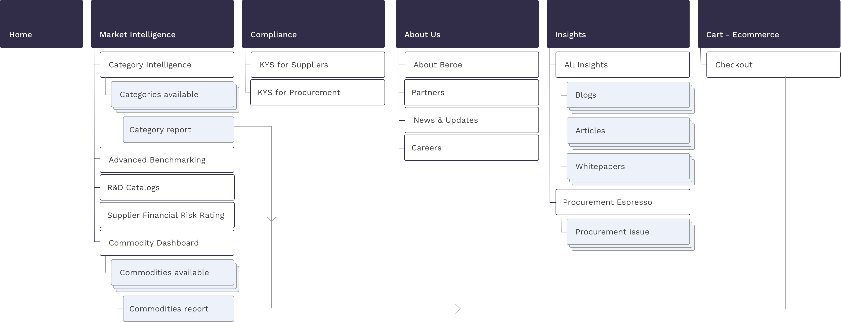
After the workshop, we conducted an internal evaluation of the website and its current sections, and map down a new information architecture.
We identified that the website consisted of multiple inner pages and sections up to 4 tiers deep, making it tedious for users to discover their interests, in turn leading to a low click rate. Based on the final list of the features required, we bucketed the main sections using the card sorting method. This allowed us to give a clear insight into the sections required.
We created a simplified architecture by eliminating and grouping the necessary elements from the existing website for easier categorization and navigation. We created the flow to achieve the maximum benefits of SEO and drive customers into e-commerce.
Mind-mapping
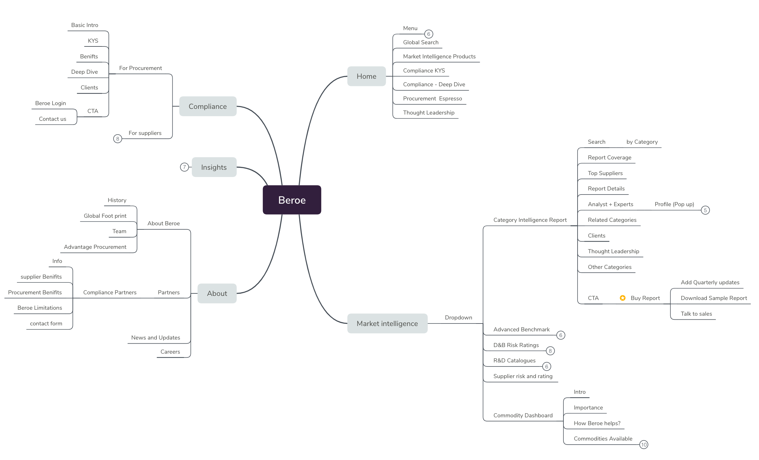
Once we had our information architecture mapped out, I created a mind map with the flow chart to map the hierarchy of the sections with interaction points for the users.
Conceptualization
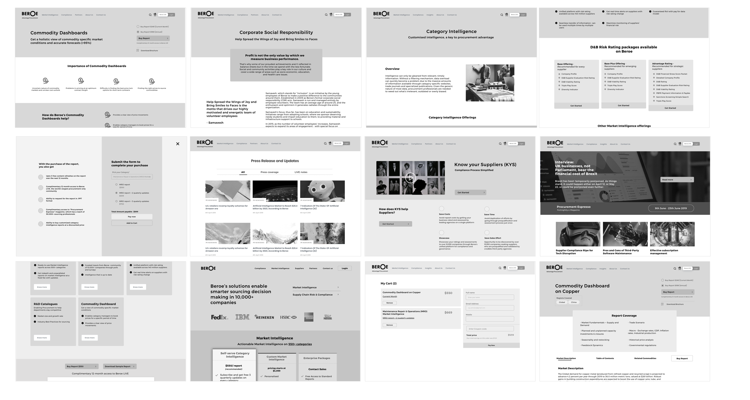
I created low-fi concepts for primary use cases. We conducted multiple usability tests with the low-fidelity mockups among stakeholders. Once we had confidence in the design, we began digitizing designs.
The Solution
Beroe's new website is easy to navigate and displays different offerings under one umbrella.
SOLUTION 1
Category Intelligence
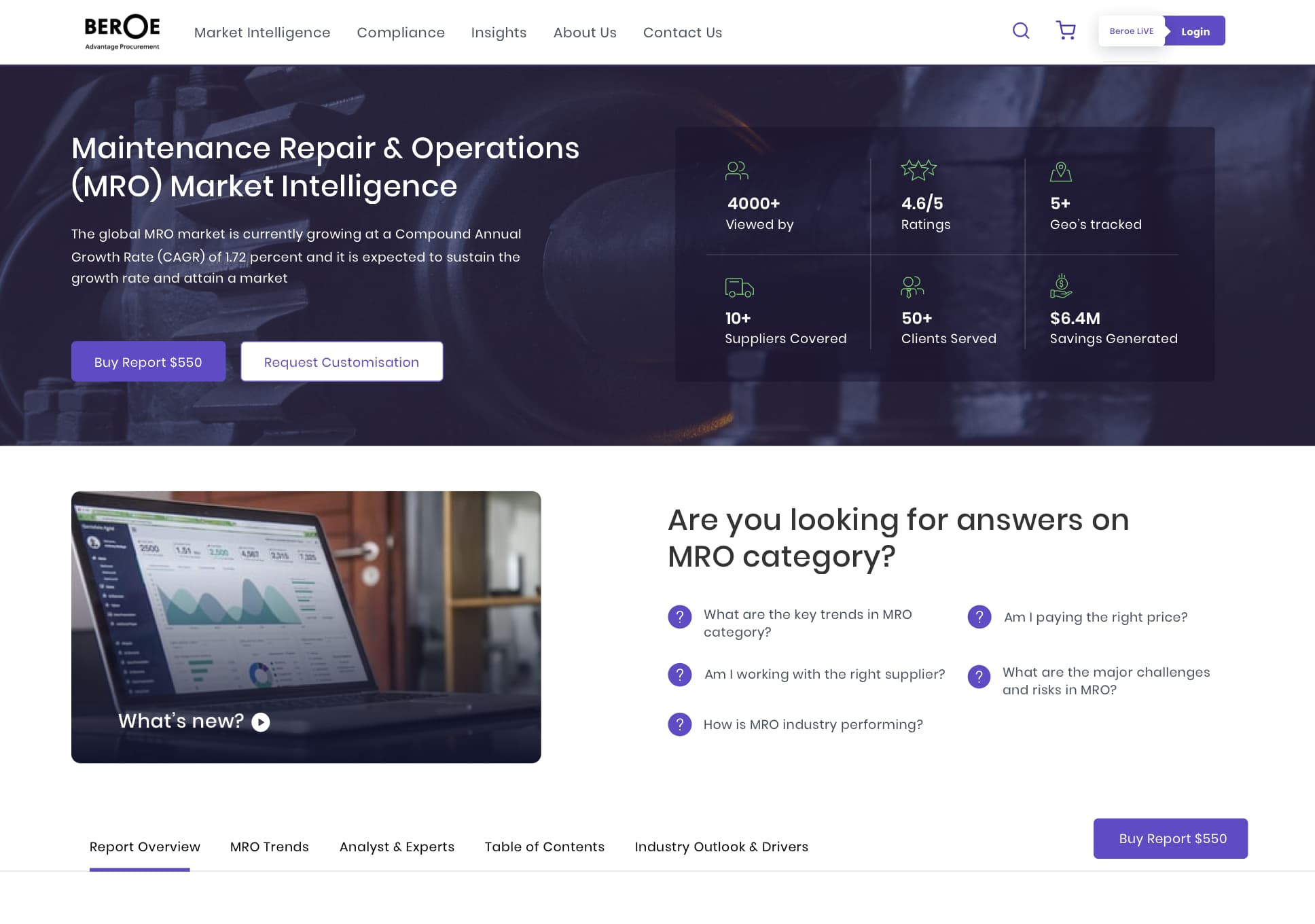
The Category Intelligence reports are the central focus of the platform. Here, Users can buy researched reports depending on the procurement area. We aimed to make these reports easily discoverable and up-sell them through various purchasing options.
The biggest challenge was to depict all the information available for the report in a consumable manner for the user.
- To simplify this, I created multiple tabs for the sections covered by the report to inform users upfront of the data being provided.
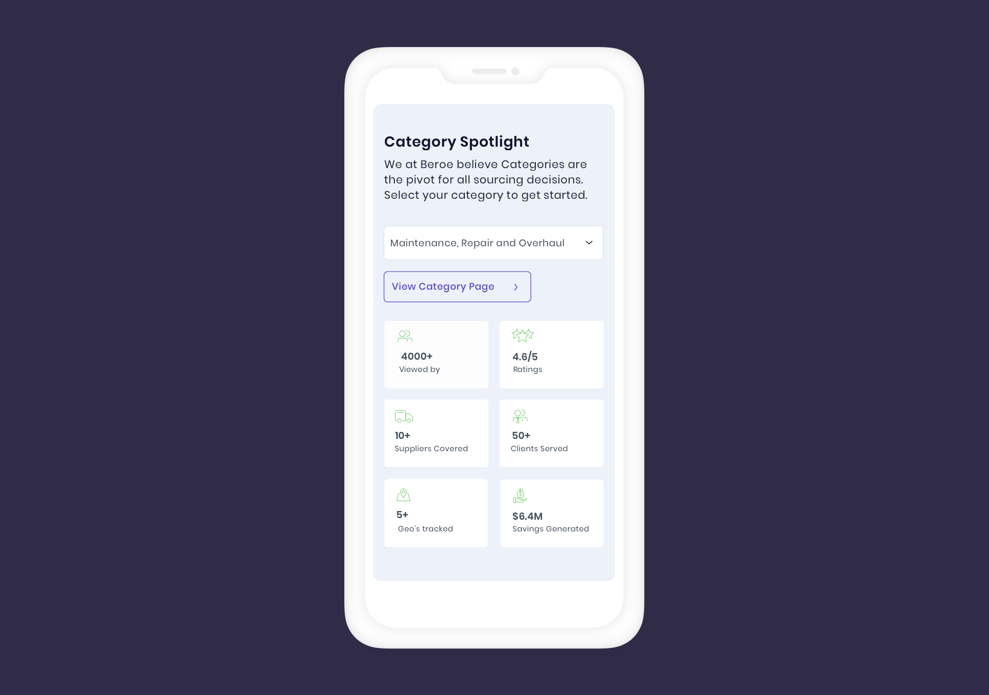
- To improve the discoverability of the reports and engagement with the catalogue, we introduced a section on the website called "Category Spotlight".
SOLUTION 2
E-commerce for faster checkouts
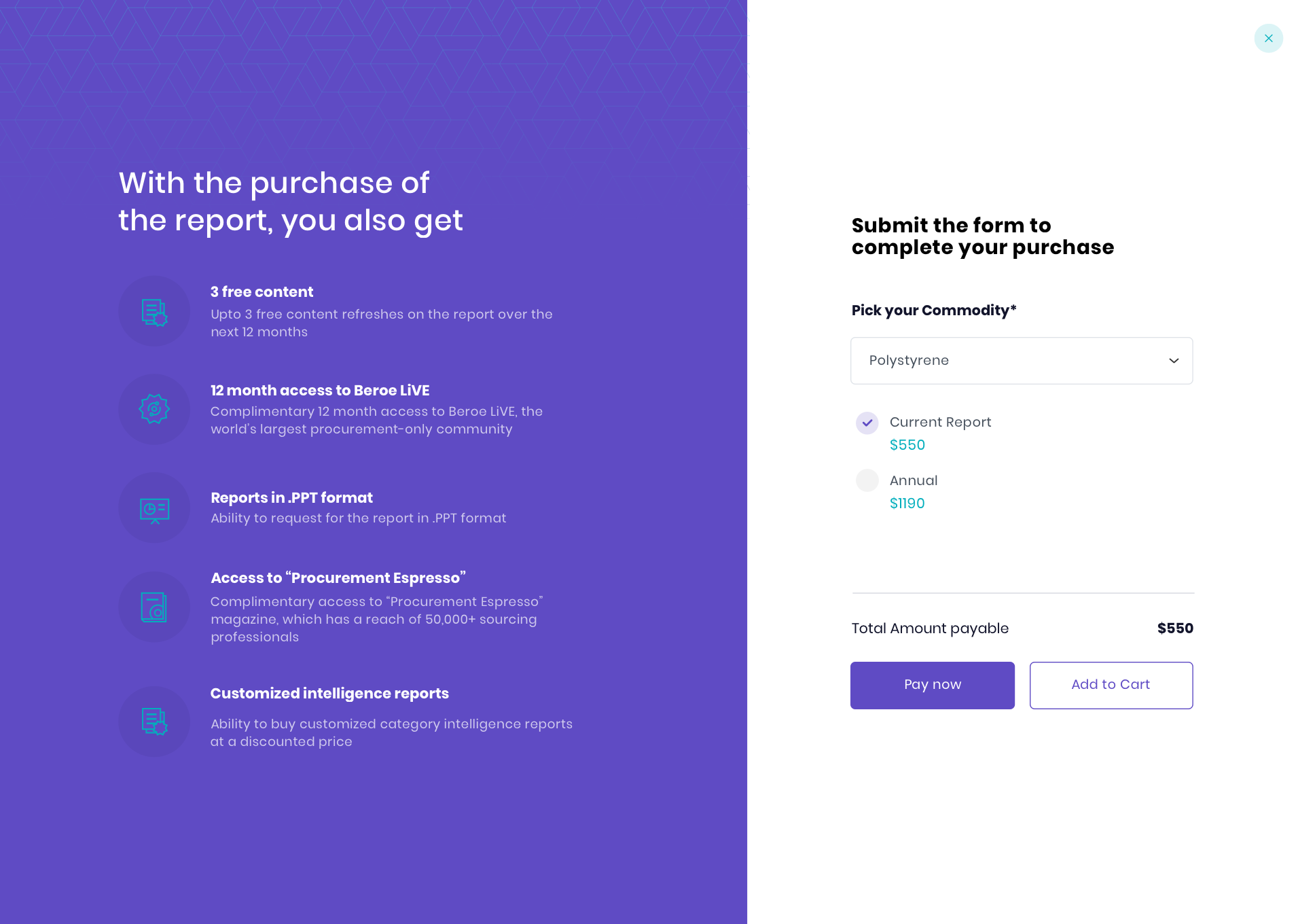
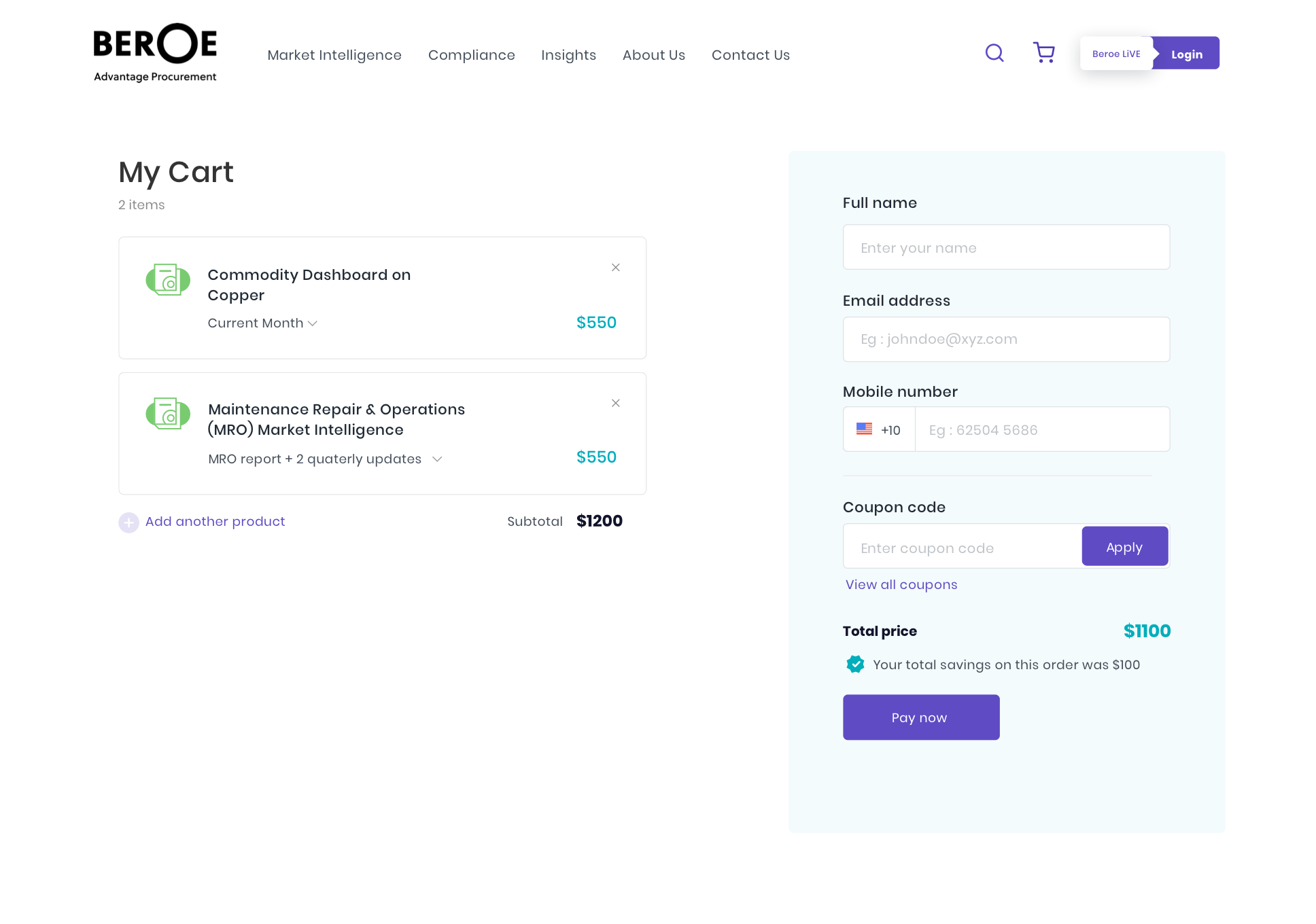
We created a system which emulated an e-commerce platform for faster and automated checkouts of reports. The system has a rigid structure with limited flexibility to allow the addition of multiple purchase options, maintaining a similar experience for all users.
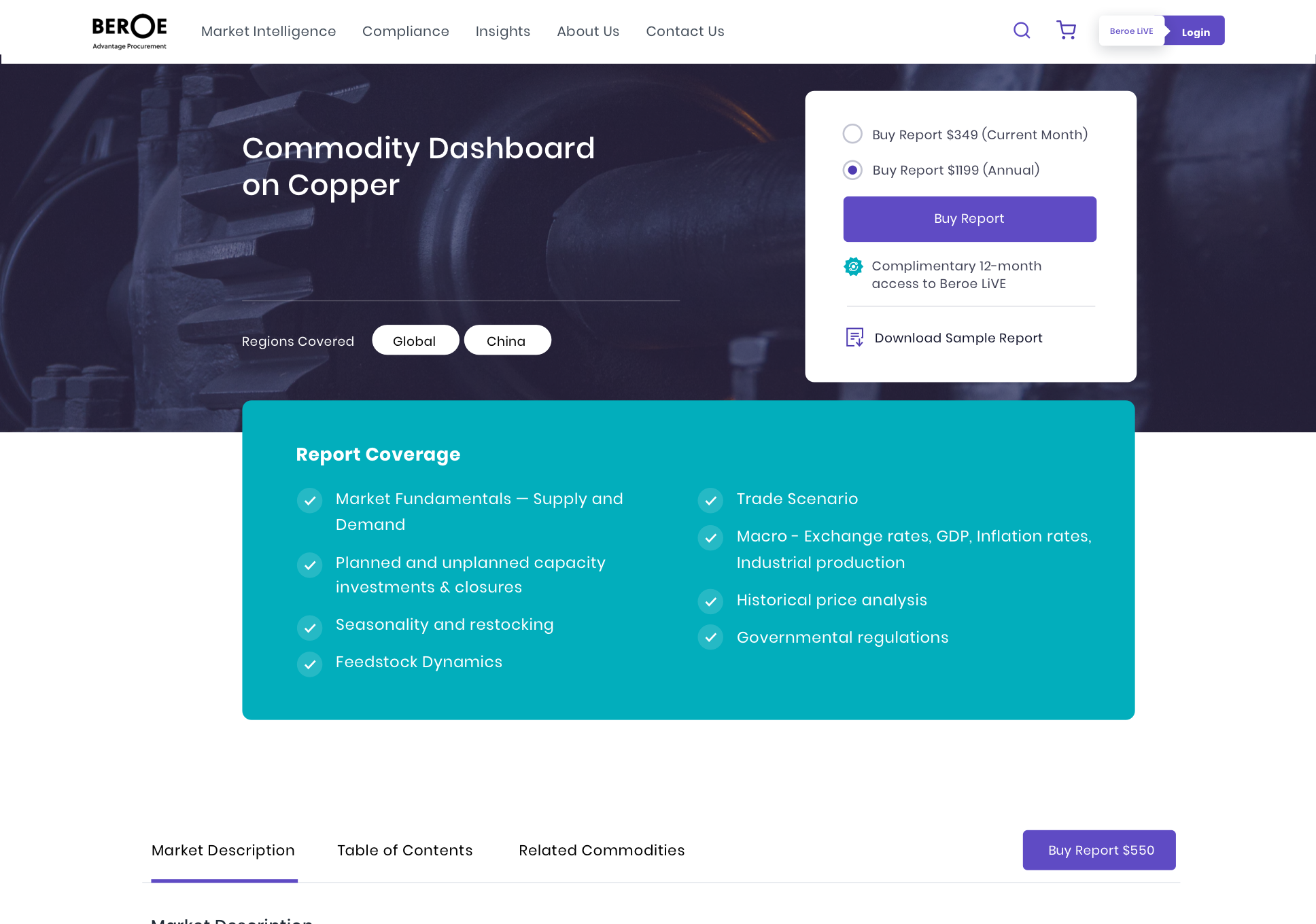
1. Choose report
The user selects reports from the category intelligence report or commodity dashboard
2. Add report to cart
Three pre-defined purchasing options for the user to choose from depending on the category report
3. Buy
Users can avail multiple reports in 3 simple steps through a fast checkout.
Learnings & Outcomes
One point of contact
Multiple stakeholders gave varied feedback on the designs, causing miscommunication and a significant delay within the timeline. To reduce the friction we established one point of contact for approvals from the company.
Human connection
During our interviews, we observed that multiple users had difficulties identifying and understanding the nomenclature used throughout the website, reducing sales. Using terms that related to the physical world is essential for a good experience.
42%
Reduction in human sales interactions
14%
Drop in the bounce rate in the first month
66%
Increase in mobile device interactions
12
Successful subsciptions placed in first month